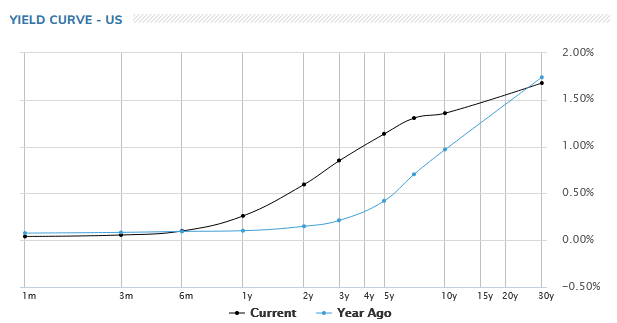
RUSSIA IS RESURRECTING THE MISSILES OF OCTOBER IN A LARGER SCALE
Challenging events are happening above the surface of our oceans. American, Chinese and even Russian naval vessels seem to be getting in each other’s space and causing occasional headlines. There’s also been an intense standoff in space where these superpowers seem to regularly create space debris in the hopes that it will smash up the other side’s massively expensive military satellites. The US had thought it had a lock on precision targetting of satellites. But, China has recently shown that it can match or better this capability.
Like everything else, military hardware is dramatically improving. The Russians are test-firing hypersonic missiles from their Severodvinsk submarines in The Barents Sea. The Chinese recently tested their new hypersonic missiles too. Officially, these are no longer ICBMs, Intercontinental Ballistic Missiles. They are FOBS, or A Fractional Orbital Bombardment System which involves sending missiles through a partial orbit around the earth to strike targets from an unexpected direction. General Milley, Chairman of the Joint Chiefs, responded to the recent FOB test calling it a “Sputnik moment” for America. China’s hypersonic weapon circumnavigated the whole globe recently for the first time. In response, the American Ambassador to the Conference on Disarmament in Geneva said, “We just don’t know how to defend against that technology, neither does China, neither does Russia.” The point is that we had ten days to save the world when the US and Russia stood on the brink of a nuclear exchange in 1962 during the Cuban Missile Crisis. Today missile systems are so fast, and increasingly automated. Will we even have minutes, let alone days?
Luckily, most nations do not want anything like that to happen. The old warfare was about damaging an opponent’s hardware before it could do any damage. The new warfare is about denial of use. It’s about damaging access to the digital operating space by disrupting access to WIFI, GPS and Sat Nav. But, that has untold consequences for civilian life we should all be thinking about.
Further complicating matters, the Superpowers seem to have spent the last decade pushing militaries themselves off-balance sheet. The debt problem has led to the privatization of militaries. We may have more mercenaries funded by governments today than at any time in history. The Russians have done the same, perhaps for other reasons. Plausible deniability is valuable in a world where conflict is remote and subthreshold. Private American and Russian mercenaries and Chinese "contracters” seem to be all over Africa, the Middle East and Asia these days. It has become nearly impossible to disentangle the role of the state and private military organizations in this new era of competition, confrontation and sub-threshold conflict.
The militaries of the superpowers have re-established strong lines of communication amongst themselves, even if the superpower leaders have not. President Biden is begging for a hotline to Beijing; however, Premier Xi Jinping seems to prefer speaking directly to CINCPAC, the Commander in Chief, US Pacific Fleet. Putin opts to send warnings about not “crossing any red lines” to the US military through the media. Most certainly, what the militaries say to each other, often without words but with weapons, might not translate into understanding amongst the general public.
When nations are nose-to-nose, but the public doesn’t know, the risk is that we get caught by surprise.
Historians will look back and be surprised that we were surprised. Isn’t that always the case?
WWIII may feel benign because it is silent, because it is digital, because it is occurring far away and without civilian involvement. Investors have priced geopolitical risk at zero. Until the public awakens to the true situation, the enormous gap between those who are in the know and those who don’t know is a danger to everyone’s future.
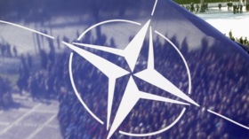
Russia will not drop a demand that NATO “be rolled back” to its 1997 boundaries, according to a senior Russian envoy, a requirement backed by the threat of “a large-scale conflict in Europe” arising out of Ukraine.
“We are not bluffing,” Russian Deputy Foreign Minister Sergei Ryabkov said Monday, per state-run TASS. “These are our real proposals. The West’s awareness of this needs to be facilitated, and we are going to make every effort to achieve it.”
Russian President Vladimir Putin has amassed military forces around Ukrainian borders, ostensibly due to the dangers presented by Ukraine joining NATO at some future date. Putin’s team, which oversaw the annexation of Crimea and the invasion of eastern Ukraine in 2014, portrays the latest round of tensions a consequence of NATO expansion over the last 25 years, raising the prospect of a major war in Europe.
“It is important to lower the degree of confrontation caused by the way our U.S. colleagues are looking after their Ukrainian proteges,” Russian Foreign Minister Sergey Lavrov said in an interview published Sunday. "The course on dragging Kyiv into NATO with the prospect of deploying attack missile systems near our borders creates unacceptable threats to Russia’s security, thus provoking serious military risks for all parties involved, up to a large-scale conflict in Europe.”
Ukrainian President Volodymyr Zelensky wants to join NATO, but that process has been stalled for nearly two decades. President Joe Biden said in July that "it remains to be seen” whether Ukraine ever will “meet [the] criteria” for membership in the trans-Atlantic alliance, but Russian officials want NATO to close the door on the idea.
“We would like to emphasize that the nonexpansion of NATO and preventing the deployment of weapons systems near the Russian border that threaten Russia’s security will be front and center during the upcoming talks with the United States and NATO,” Russian Foreign Affairs Ministry spokeswoman Maria Zakharova said Saturday. “This is something those who until now have been unable to grasp Russia’s position must understand.”
NATO leaders agreed in 2008 that Georgia and Ukraine should have the option at some point of joining the alliance, but Russia has invaded both of those countries in the intervening years, creating territorial disputes that short-circuit using the trans-Atlantic alliance’s collective defense guarantee to avert a conflict.
"Yet the Kremlin has, in effect, exercised ... a veto,” former U.S. Ambassador to Ukraine Steven Pifer wrote in October. “Allies appear unenthusiastic ... because there is no good answer to the question ‘if Ukraine joins NATO tomorrow, does the alliance then find itself at war with Russia?’”
Putin has sought to pose that question even in the absence of any serious progress toward Ukrainian membership in NATO.
“We demand an official withdrawal of the decision made at the 2008 Bucharest summit relating to Ukraine and Georgia’s [intentions] to join NATO,” Ryabkvo said. “When we say that further expansion of NATO needs to be prevented, when we say that NATO facilities and all kinds of activities that are provocative for Russia need to be rolled back to the positions that existed in 1997 when the NATO-Russia Founding Act was signed, we are not bluffing.”
Russia warns of potential ‘large-scale conflict in Europe’
Russia's top diplomat believes that US-NATO missiles near the Russian border would increase tension and worsen the risk of escalation.
FILE PHOTO. © REUTERS / Francois Lenoir
Ukraine’s possible accession to NATO poses “unacceptable threats” to Moscow, including the possibility that missile defense systems could be placed directly on the Russian border, the country’s foreign minister said on Friday.
Speaking to Bosnian newspaper Oslobodjenje, Sergey Lavrov said that all parties need to reduce the “degree of confrontation” caused by American officials and their work with their “Ukrainian protégés.”
“The policy of dragging Kiev into NATO with the prospect of missile strike systems appearing near our borders poses unacceptable threats to Russian security, provoking serious military risks for all parties involved, up to and including large-scale conflict in Europe,” he said.
Lavrov’s comments to the Bosnian outlet come as relations between Russia and the US-led military bloc remain at a crisis point.
The recent uptick in tensions follows reports that Moscow is massing troops on the Ukrainian border, with some Western media outlets suggesting an invasion is around the corner. NATO has repeatedly warned Russia that it is preparing a set of sanctions that would be imposed if any military action is taken.
Earlier this week, at an expanded meeting of the Ministry of Defense, Russian President Vladimir Putin explained that, if NATO infrastructure appeared in Ukraine, it would only take 7-10 minutes for a missile to reach Moscow, stressing that this was “a serious challenge for Russia.”
Last Friday, Moscow pitched a list of proposals to the US and NATO in the form of two draft treaties. The documents consist of a list of security guarantees, including a demand that NATO won’t expand eastwards into states that were formerly a part of the USSR. If signed, it would also see troop movements near the Russian border be limited and prevent missiles from being placed near the frontier.